2024
Aquaponics SD: Fish Gardens
CATEGORY
Packaging
Branding
CLIENT
Aquaponics SD
PROGRAMS
Illustrator
Photoshop
AQUAPONICS SD: FISH GARDENS is a playful, science-forward brand designed to introduce children and families to the fascinating world of aquaponics. Rooted in sustainability, curiosity, and hands-on learning, the brand celebrates the natural harmony between fish and plants, turning education into a fun and interactive experience.
DESIGN PROCESS
Research
The fish tank packaging at pet stores inspired the concept of what the packaging of Aquaponics SD could be, from the template and colors to the information required on the box.(Please forgive the low quality, I took these
photos with my phone.)
The Aquaponics SD current website was also researched, taking note of the main key information to transfer onto the packaging.
DESIGN PROCESS
Sketches
An illustrated approach for the branding to capture kids' hearts and make aquaponics fun and exciting!
FINAL DESIGN
The Brand
The Aquaponics SD logo draws inspiration from the aquaponics system, highlighting the connection between fish and plants. The design combines the shapes of a Tetra fish and a Monstera leaf into a single, cohesive logo that visually represents this concept. For some contrast, the color palette features green tones to represent plants, set against a light blue background that represents water. For the Fish Gardens sub-brand, the logo takes on a simpler design to provide balance within the overall brand identity. It maintains the blue color palette for consistency but introduces wavy lettering under “Gardens” to mimic the motion of water. Both logos share a playful, illustrated style designed to appeal to children and spark their curiously about fish, plants, and the science behind aquaponics.
FINAL DESIGN
Packaging
& Dieline
INTERACTIVE AND FUN! At the front panel, two characters, a tetra fish and a basil plant, are featured to capture kids attention. On the side panel also includes an interactive coloring comic strip where the same characters interact, helping children understand the concept of aquaponics through storytelling. The back panel provides additional information and details of the kit, such as the size and what it includes. The right panel shows a list and images of fish and plants to buy for the kit. Back to the front, key information, such as the recommended age range, the tagline, and the tank’s capacity, are highlighted in orange bubbles. These elements are also color-coordinated with the fish character.
FINAL DESIGN
Business Card
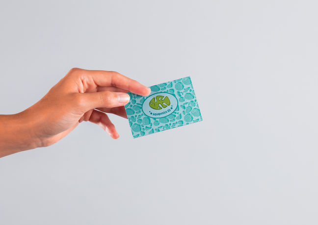
The design incorporates the Aquaponics SD logo, along with the same pattern used in the packaging. The pattern is inspired by the organic shapes of fish, fish garden ponds, and rocks found in fish tanks. For the more detailed version of the pattern on the front of the card, these elements are manipulated into water ripples, adding a dynamic look. The back of the card features a more simplified version of the pattern, maintaining visual harmony with the overall branding.
FINAL DESIGN
Website
Maintaining brand consistency, the website introduces the brand identity while incorporating the characters and illustrations from the packaging. They act as interactive icons for navigating the three key pages, including the “Plant Guide”, “Our Kits”, and “Fish Guide”. As users scroll down, the site provides additional information about aquaponics. The same template is used for the iPad and, a more simplified version, for the iPhone.


